Aside from Haas and Williams, no other team on the grid looks substantially different than it did last year in regards to livery design.
Sure, Ferrari is now using matte red, McLaren has blue accents, and there’s more “Alfa Romeo Red” on the Sauber, but those aren’t exactly revolutionary changes. On top of that, it seems like every year some third-party designer comes out with better liveries than the actual teams, and we can’t help but take notice.
The following designs belong to one Ricardo Cabrita, who like many of us believes that every single team in Formula 1 deserves a considerably more spectacular design, with more contrast and patterns to speak of. Here’s what he came up with:
Mercedes-AMG Petronas F1 Team

We should mention that Cabrita used an identical car for all of his designs, so the only difference is the livery itself.
Now that that’s clarified, let’s kick things off with the current title-holders, Mercedes. Their 2019 car, dubbed W10 EQ Power+, looks a lot like last year’s car, except for that intricate black pattern used on the engine cover. However, this hypothetical livery is a lot more “electric”, dare we say, with a multitude of green stripes zigging and zagging across the silver body. It definitely has a certain aggressiveness to it, don’t you think?
Scuderia Ferrari

The Italian outfit did a pretty good job building on its 2018 livery, using a matte red colorway, with contrasting black accents on the engine cover, lower body, halo cockpit protection, front wing and rear wing.
This render however rocks even more contrast, with red, black and white featured heavily throughout. The one negative Ferrari purists might point to is that all that white in front and on top of the cockpit kind of gives the car a whole new identity, which isn’t necessarily a good thing in a sport where tradition matters, especially for such a storied team.
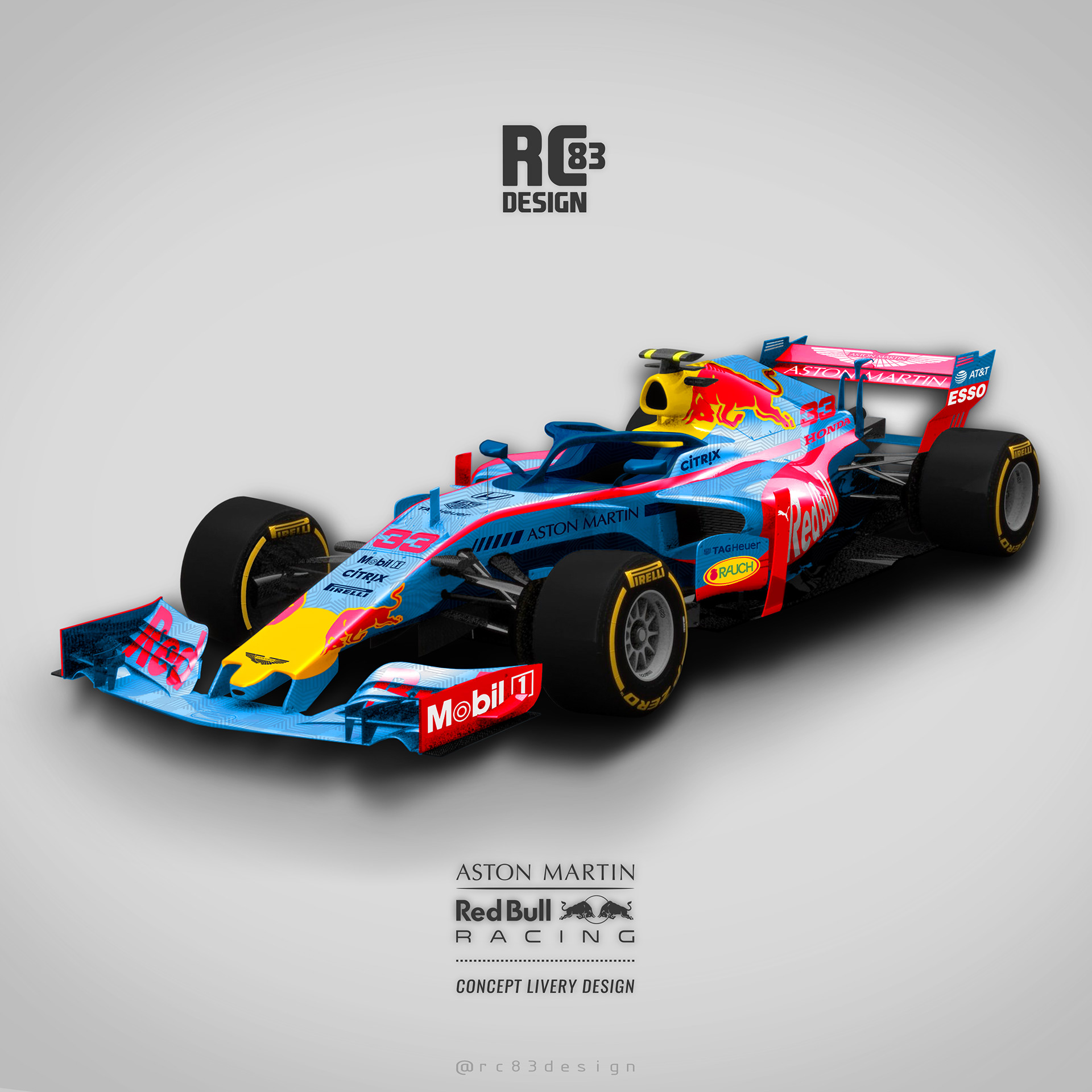
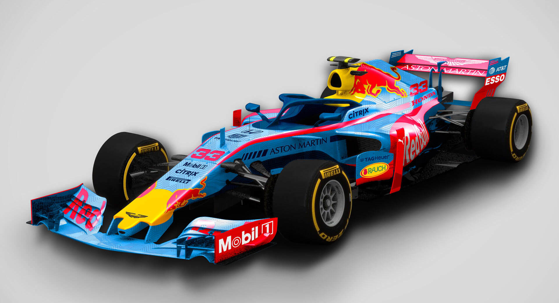
Aston Martin Red Bull Racing
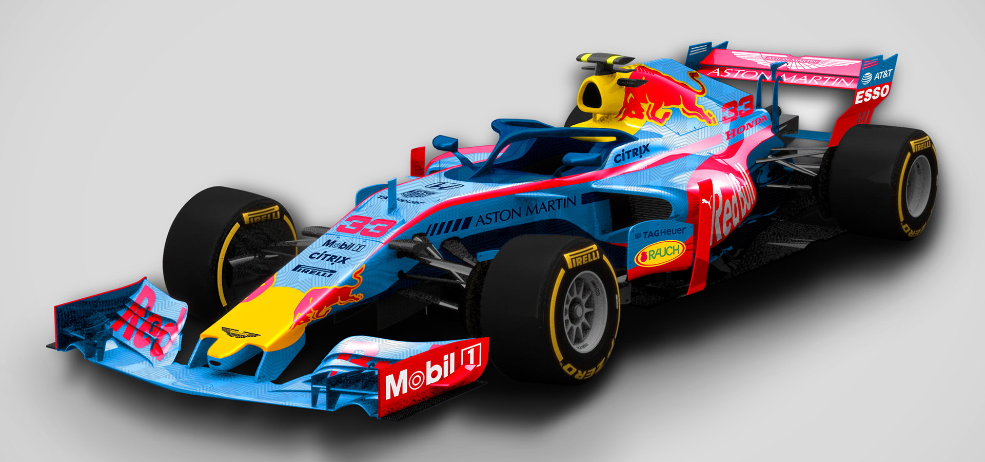
If there’s one team that consistently teases its fans with fresh new livery designs every year, it’s Red Bull. However, designs like the Camo Bull exist only for testing purposes, and by the time pre-season arrives, the Austrian outfit reverts back to its regular colors and designs.
Well, how about this fresh new take on what a Honda-powered Red Bull F1 car could look like? Gone is the matte dark blue, replaced by a light blue color housing an intricate pattern. While red and yellow endure, swapping shades of blue can make all the difference in the world, as this now looks like a completely new car, for better or worse.
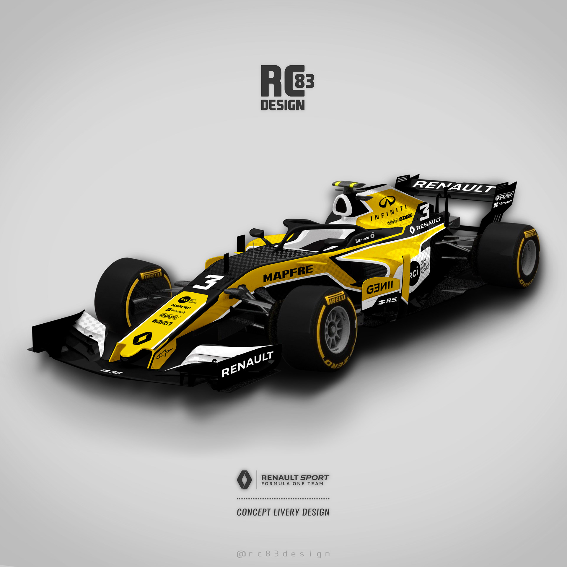
Renault Sport F1 Team
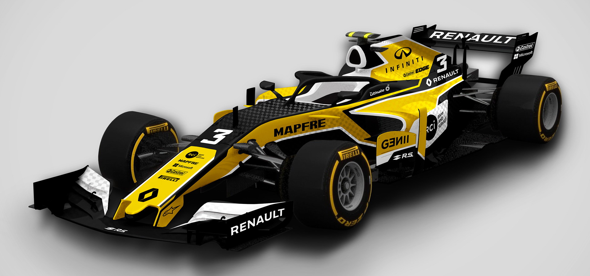
Renault’s 2019 livery is very similar to the one used on last year’s R.S.18 car. We won’t comment much on it because this is still a relatively new team (newly returned team to be more exact), which means people probably haven’t had enough time to become fed up with their design.
Still, in case you have, here’s a different take on a yellow and black livery that includes checkered patterns and some white accents for good measure.
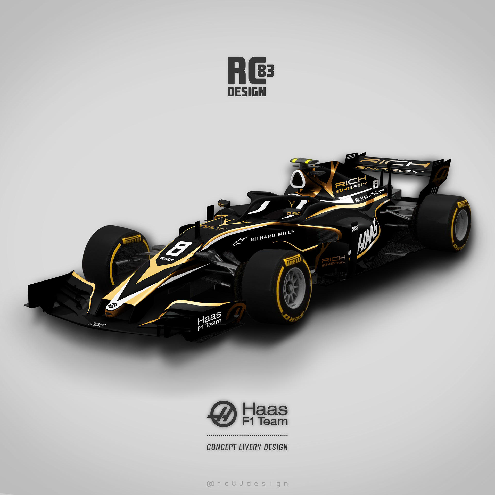
Haas F1 Team

Haas is one of the two teams whose new car looks completely unlike the one from last year. The VF-19 is wearing all-black with gold accents, courtesy of title sponsor Rich Energy.
Now, if you think those accents are too subtle, here’s a more blatant take on the whole black and gold aesthetic, one that almost puts the “rich” in Rich Energy – pun intended. It may not be to everyone’s liking, but one thing you can’t say about it is that it wouldn’t stand out.
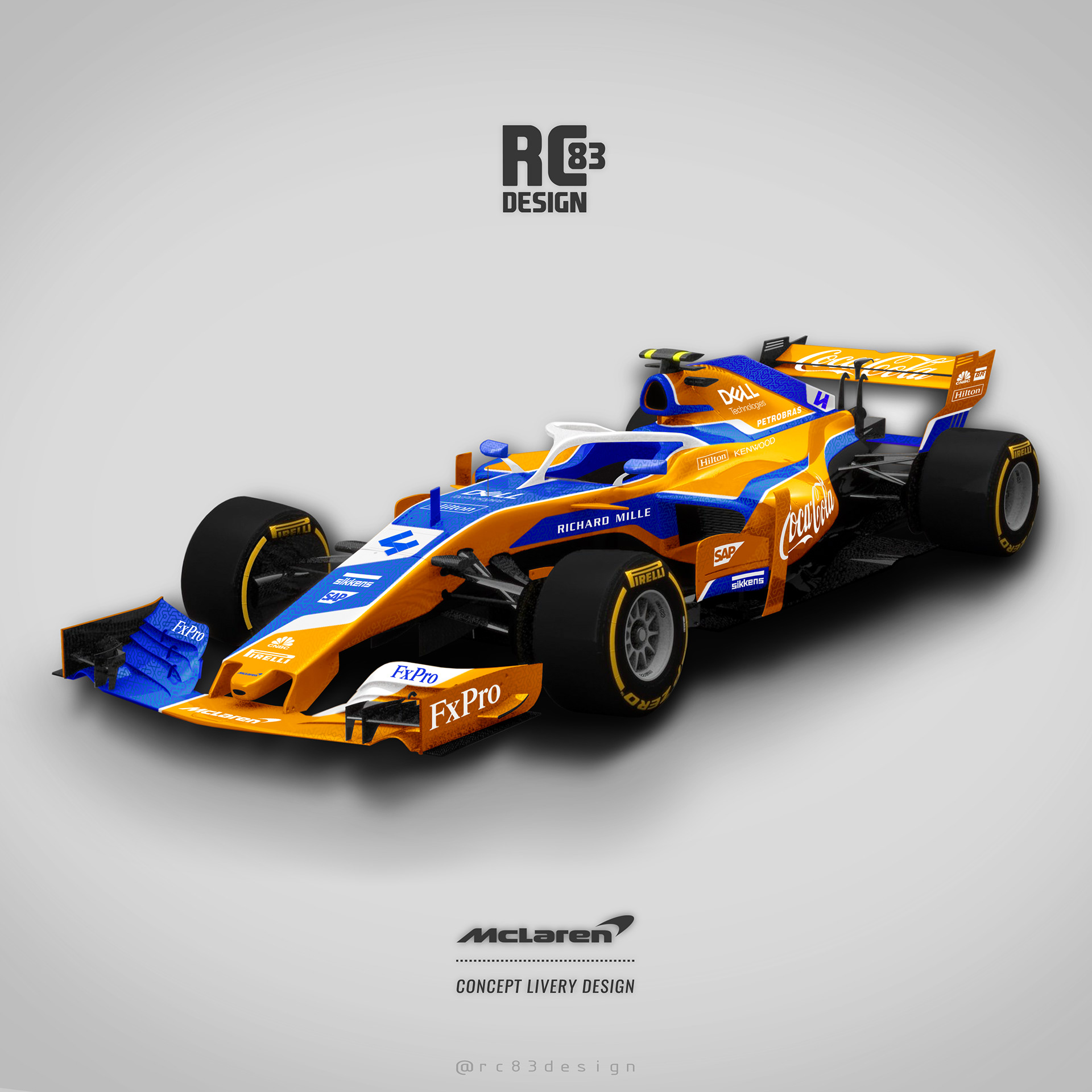
McLaren Racing
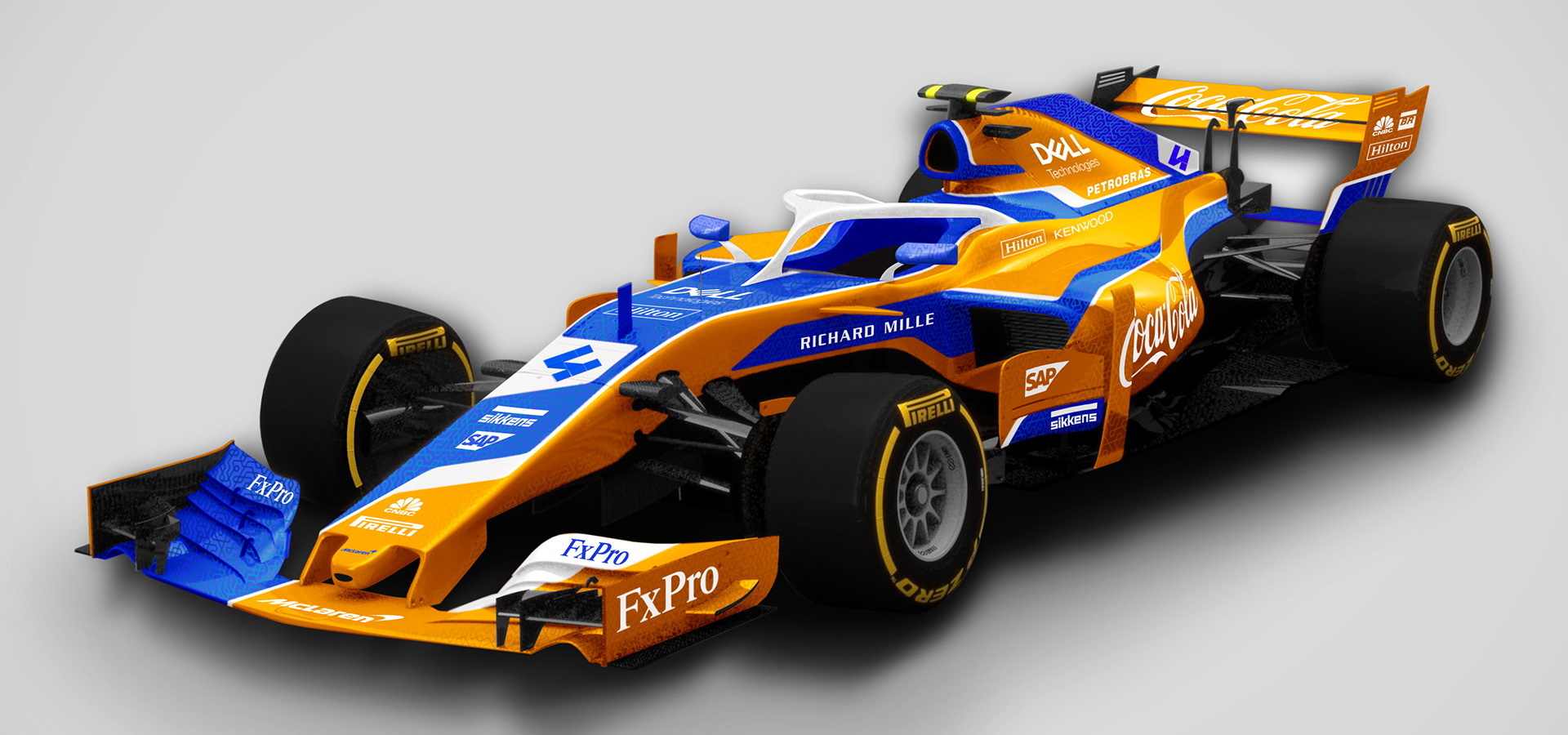
Compared to the new 2019 livery, this computer-generated one is a little more intricate in its design, using blue more extensively while adding white accents and an all-white halo, instead of a black one.
It’s also interesting to see a front wing that’s completely blue on one side and orange and white on the other. Speaking of orange, this particular shade appears more mustard-like than papaya. We’ll let you tell us if you think that’s good or not.
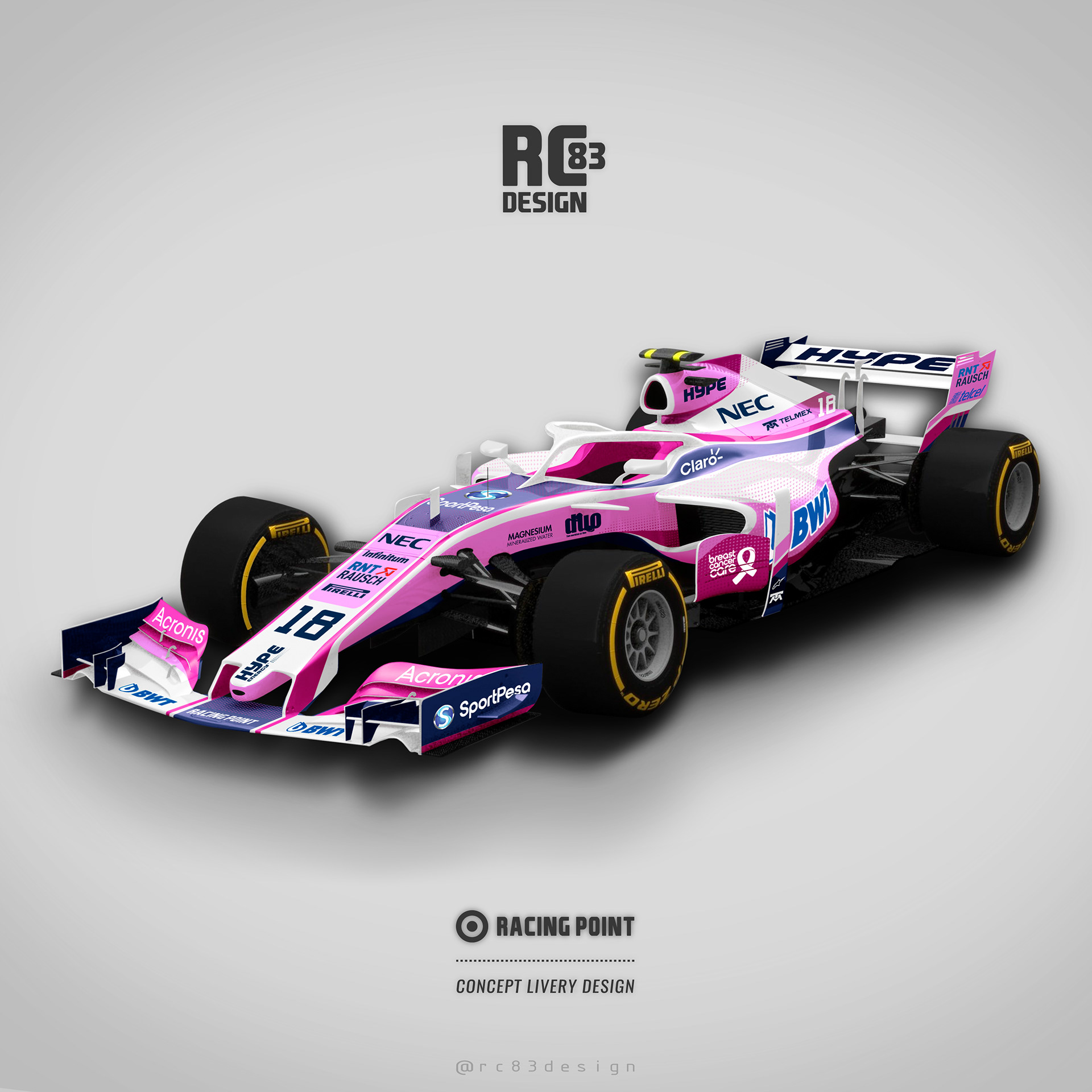
Racing Point F1 Team

In reality, this car boasts an evolution of last year’s BWT pink livery, albeit with a little more blue to honor new title sponsor SportPesa.
The render however offers up a considerably sharper design, while pretty much using those same colors. We could argue that this design looks more modern and a bit cleaner with the all-white halo – the real RP19 has a dual tone pink and white halo design.
Alfa Romeo Racing

Designing an Alfa Romeo Formula 1 graphic was always going to be difficult if your goal was to not end up with something that looks a little too…Ferrari-ish.
The real-world solution to this problem was to draw up a livery that was half Sauber and half Alfa Romeo, which is exactly what happened with the C38 race car. Still, a bolder interpretation might look a little something like this render here, with extra red spread across the body.
Scuderia Toro Rosso

Toro Rosso’s cars have looked almost the same for years now. The livery on the 2019 car is nearly identical to that of the STR13, although the graphics are a tiny bit sharper.
What this rendering does is add a lot more silver and a great deal more red to the mix, so much so that is looks more like a traditional Red Bull than a Toro Ross – which may not be an issue if the former would actually revamp its livery too.
Williams Racing

After securing a multi-year agreement with telecom company ROKiT, Williams has gone with a combination of light blue and white for this year’s livery design, as opposed to its old Martini-branded cars from years past, which were mostly white with red, light blue and royal blue accents.
The render, as you can see, is completely different, although to be fair, the designer didn’t take into account the team’s new title sponsor, which is probably why the car looks more like an old Manor than a Williams.