The speed with which automakers have raced away from traditional auto shows toward the Consumer Electronics Show (CES) has less to do with Las Vegas’s great weather and everything to do with how they want to be seen as leaders in the tech field.
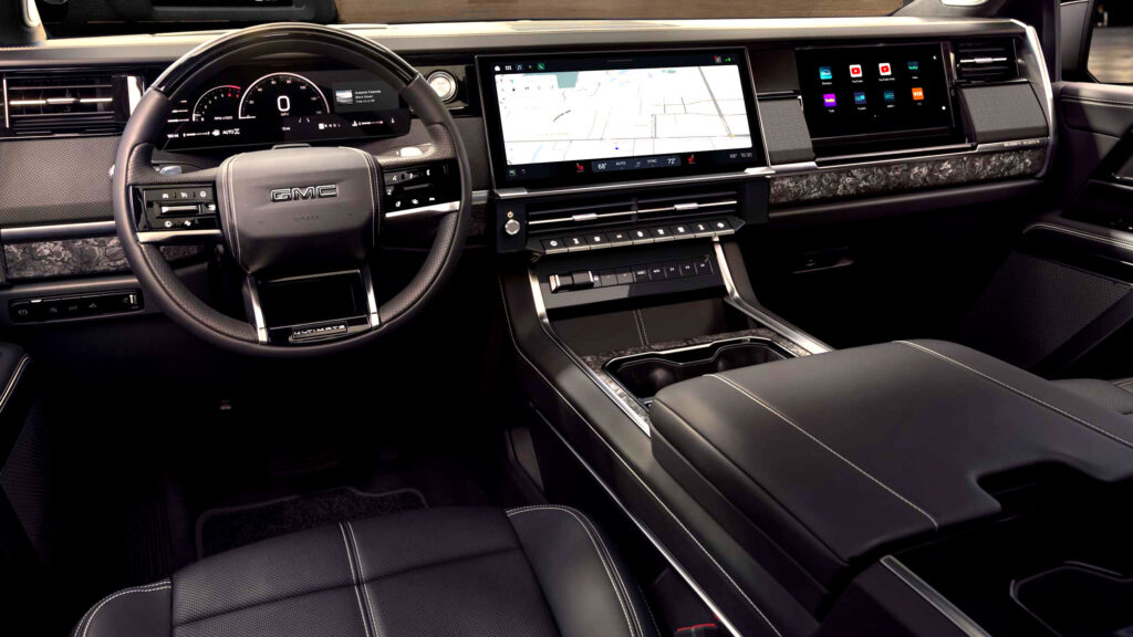
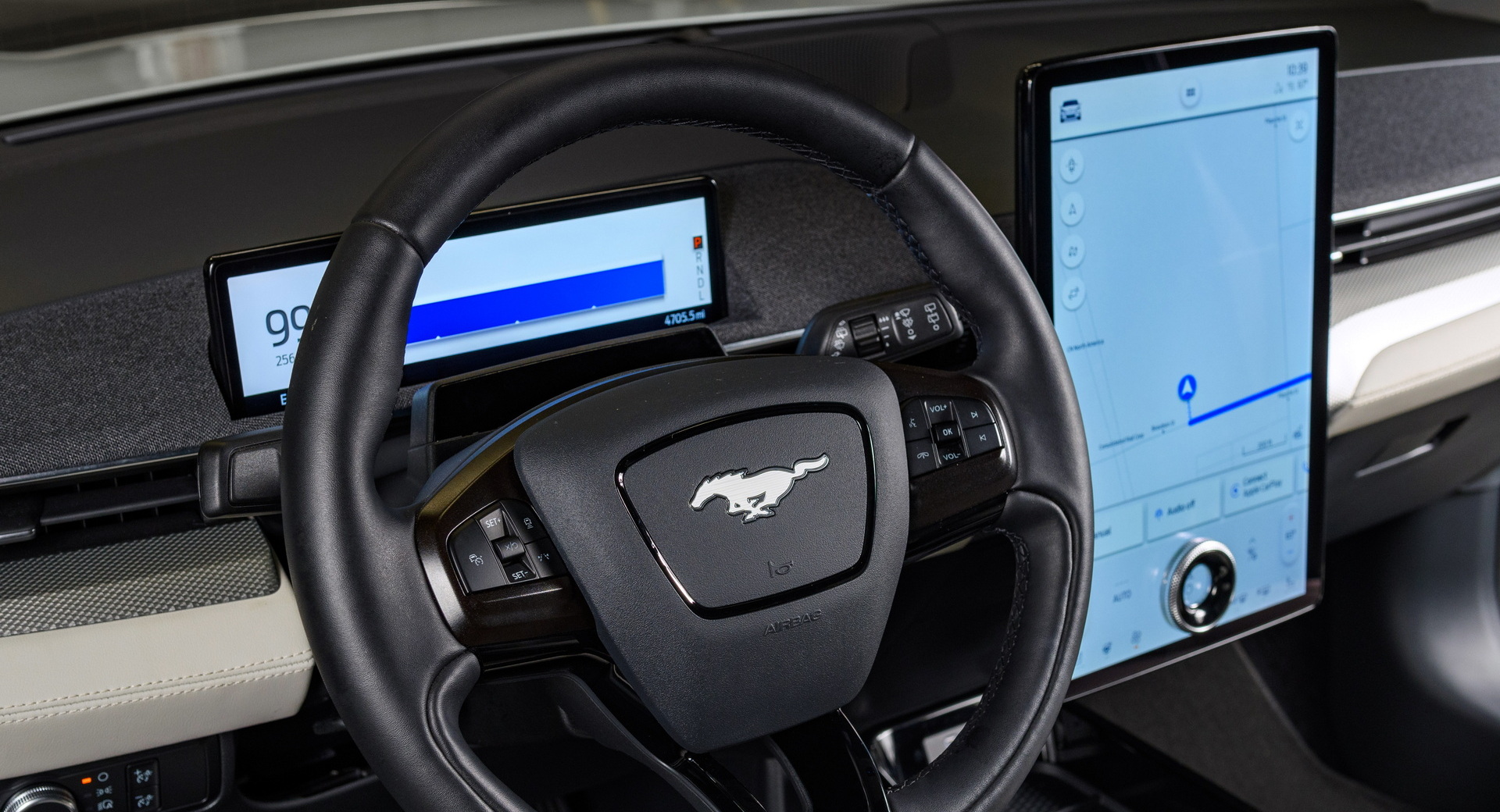
The race for bigger, better screens that can do more and be updated often has led vehicle interior design to shift pretty dramatically. Once overflowing with buttons and knobs, the hippest interiors are now pretty minimalist. Which led us to wonder, what do people actually want?
I’ve long felt that relying on screens alone is foolhardy. When touchscreens take over all of a vehicle’s infotainment duties, that inevitably leads to menus, which just as inevitably draw attention away from the road. You can’t feel a “button” on a screen, meaning you must look at the screen and not at the road. It may seem innocuous, but if we agree that looking at a phone while driving is dangerous, then trying to do something on a screen that’s just as far from the road must also be dangerous.
Read Also: Tesla Is Shipping Vehicles With A Swiveling Screen According To New Video
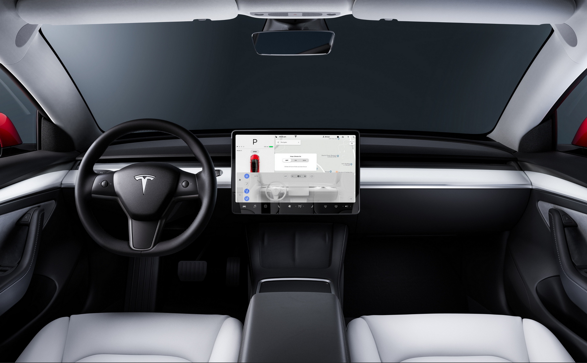
There are also aesthetic arguments to be made against the rise of screens. The Tesla Model 3, for instance, would bore even the most ardent minimalist. And I’m pretty sure that if you asked an interior designer they’d tell you that minimalism is so 2010s.
Having said that, there was a period of time when vehicles had many of the features they have today but had to make do with smaller screens. That did sometimes lead to cars that were comically overburdened with buttons. Just because you can feel a physical button doesn’t mean you’ll instantly know what it does when it’s surrounded by dozens of others, which isn’t really that much safer.
What do you think? Should we go all-in on touchscreens? Avoid them at all costs? Or is there a way to design intelligently that’s the best of both worlds?