Nissan recently unveiled a new simplified logo and the brand is pretty excited about it. So much, in fact, that it asked Professor David Bihanic, a Designer and Lecturer at the University of Sorbonne in Paris, to analyze its new logo.
Professor Bihanic appears to be impressed because he says that the lifecycle of any logo is one of necessary simplification.
“A logo, to remain [a] strong sign, must evolve in the direction of simplicity,” said Bihanic. “Achieving this ultimate goal is the guarantee of the brand’s real sustainability over time.”
Indeed, the new Nissan logo satisfies the professor’s two required elements: a graphic stamp and a name or label text. A slogan can be added to this, but the goal is to simplify as much as possible.
As was the case for Nike’s swoosh, Bihanic’s necessary simplification can mean that logo elements are stripped away until only the graphical stamp remains.
Read More: The Work Of Nissan’s Designers Goes Well Beyond Its Cars
![]()
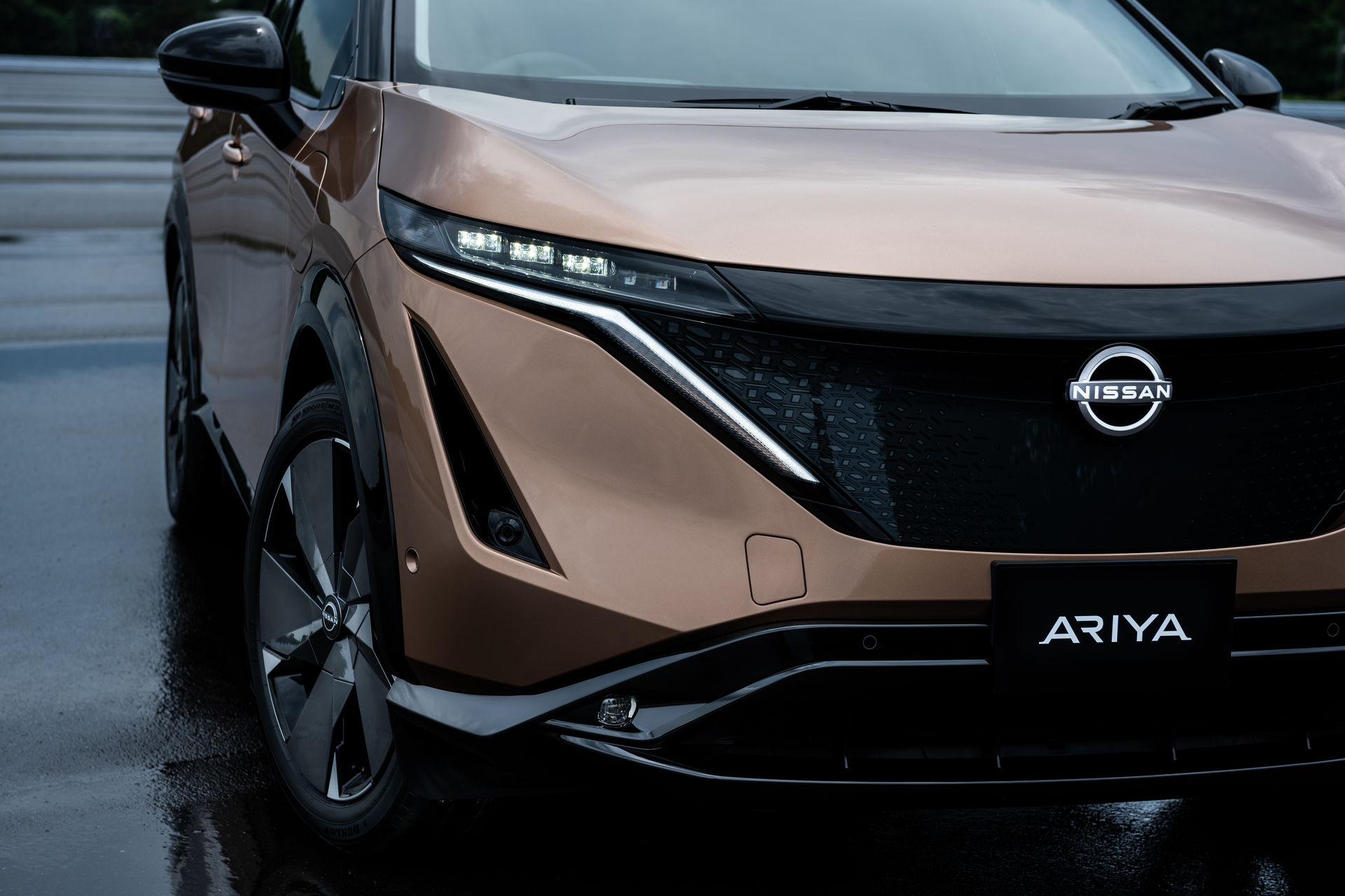
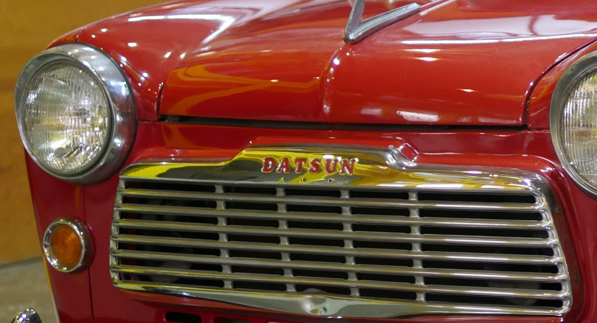
Although Nissan’s latest logo has been stripped down to its barest elements, it shares many of the same elements as it did when it debuted in 1933. It can trace its roots to the Datsun logo, which featured the Japanese flag’s red disk and a blue rectangle with white lettering.
That’s still essentially what appears on Nissans today, albeit with simplified elements and no colors. And that’s important because the continuation that provides is an important signal to customers.
“This part of the identity must never be seen to give way or be interrupted when updating a visual identity, except to signal, for example, a radical change in management or in the direction of the company, this requiring the repositioning of its very brand,” said Bihanic.
Fortunately, for fans of variety, Nissan gave designers a lot of freedom when it came to the badges that ended up on cars. Moving from hard, block letters in the ’50s, to flowing cursive letters in the ’60s, and then back again the “Nissan” lettering has changed a lot of the years, sometimes appearing without any disk behind it at all.
Each was in some way representative of the time it came about in. Indeed, the latest logo was designed for the simplicity of the upcoming electric era but also to look good as an app on your phone screen.
According to Tsutomu Matsuo, deputy general manager of Nissan’s advanced design department, the logo speaks to Nissan’s strengths.
“The new Nissan logo communicates our guiding message, carried over from past iterations: If you have a strong, determined belief, it can even penetrate the sun,” Matsuo explained.