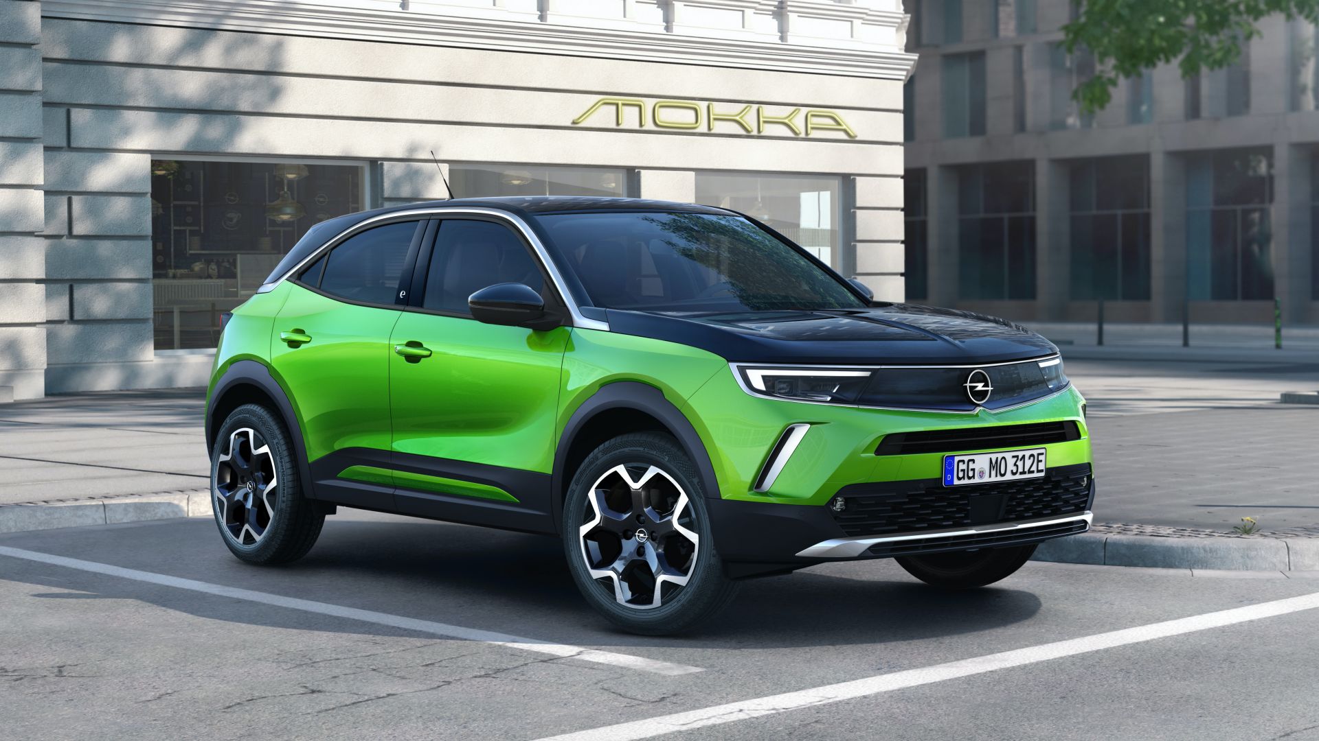
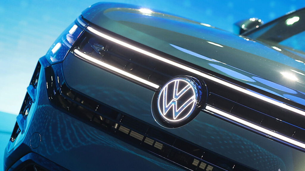
Opel unveiled the all-new Mokka last month but very few people noticed that the subcompact crossover featured an updated ‘Blitz’ logo.
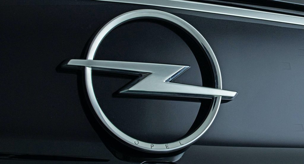
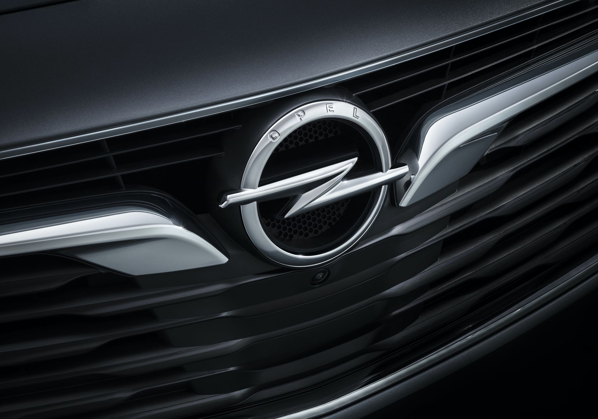
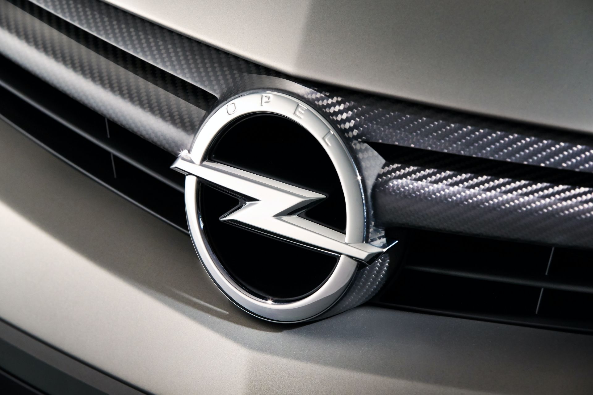
Much like Volkswagen subtly updated its brand logo last year, Opel has given its emblem a discreet tune-up. Set to adorn all upcoming models from the German carmaker, the iconic flash logo now features a slimmer surrounding ring, with ‘Opel’ lettering integrated in the lower part of the ring.
Opel Vice President of Design Mark Adams likens the lettering to “a fine engraving in a piece of jewellery.” The flash itself does not seem to have changed that much, apart from having a flatter surface now.
See Also: Nissan Trademarks New Brand And Z Sports Car Logos
“The surrounding ring is now slimmer, more elegant, more precise and more distinctive. This emphasizes the flash even more. All details are super sharp with a very small radius,” Marc Adams says.
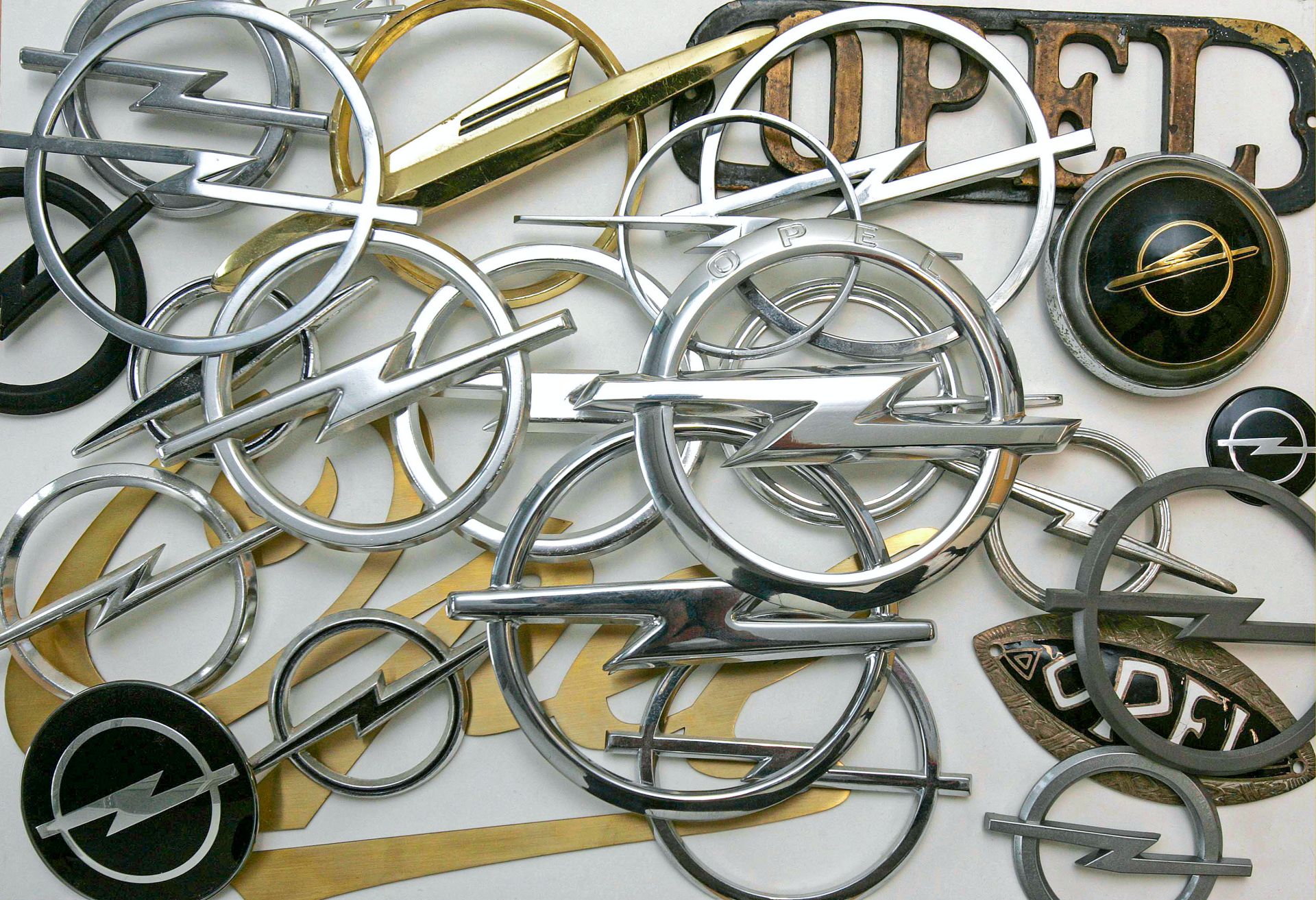
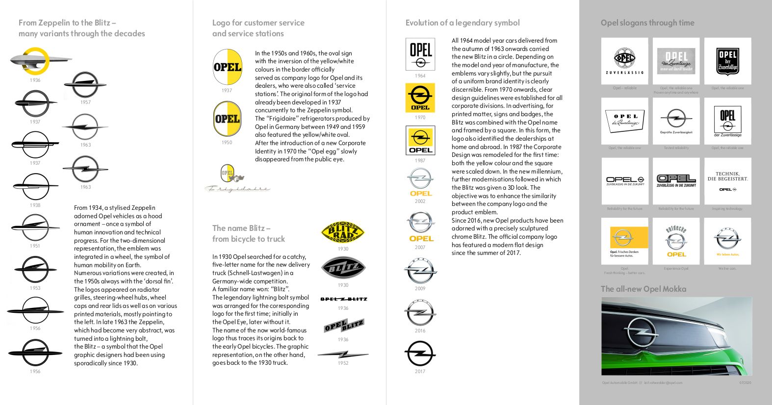
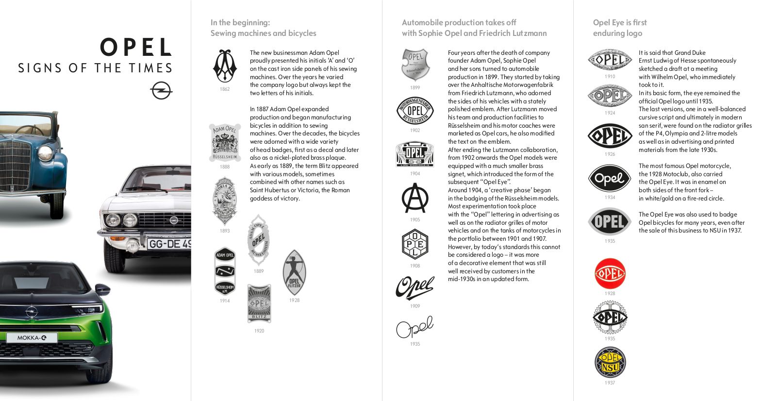
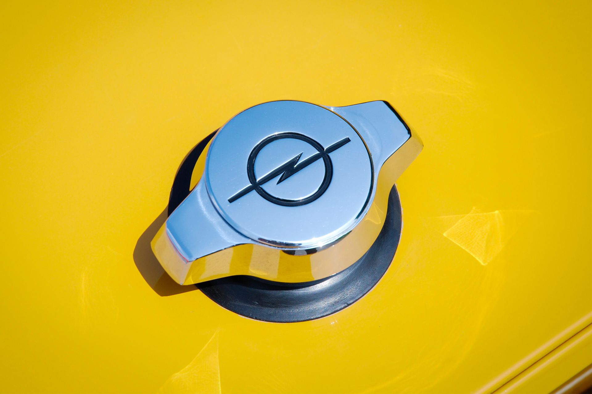
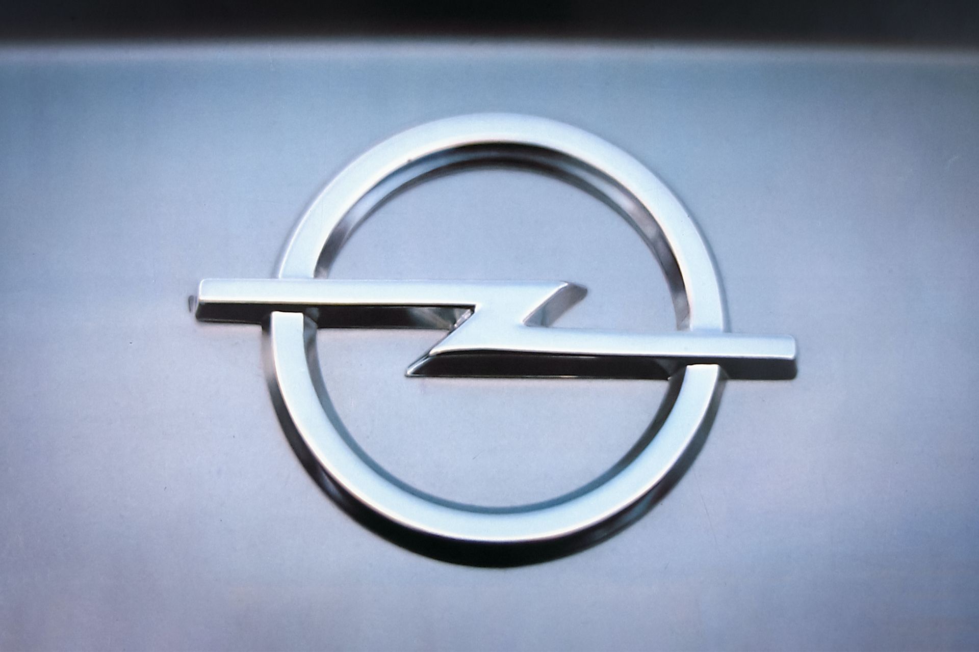
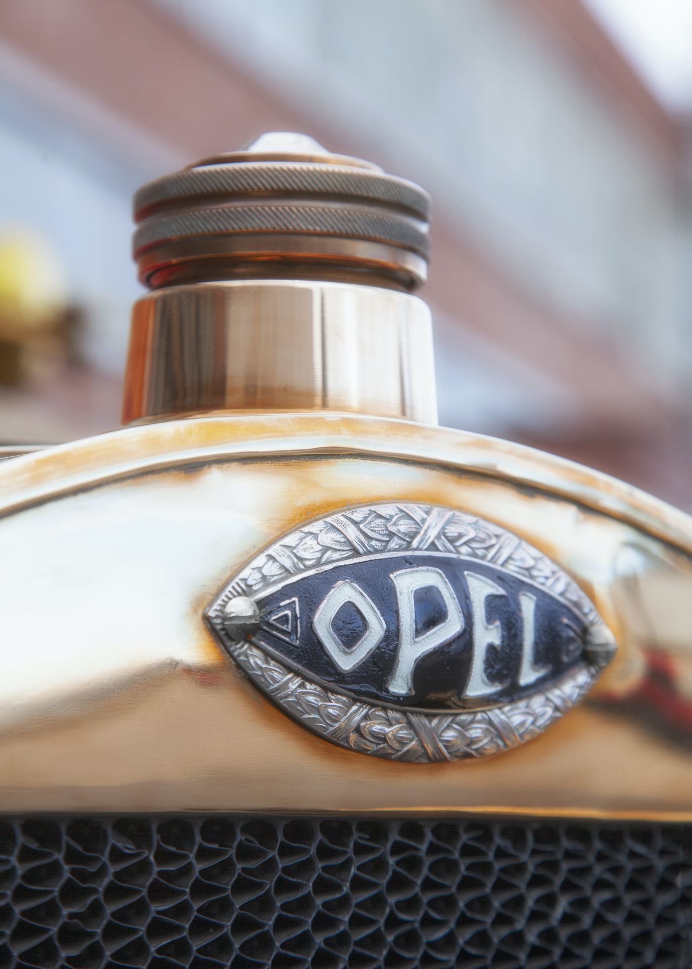
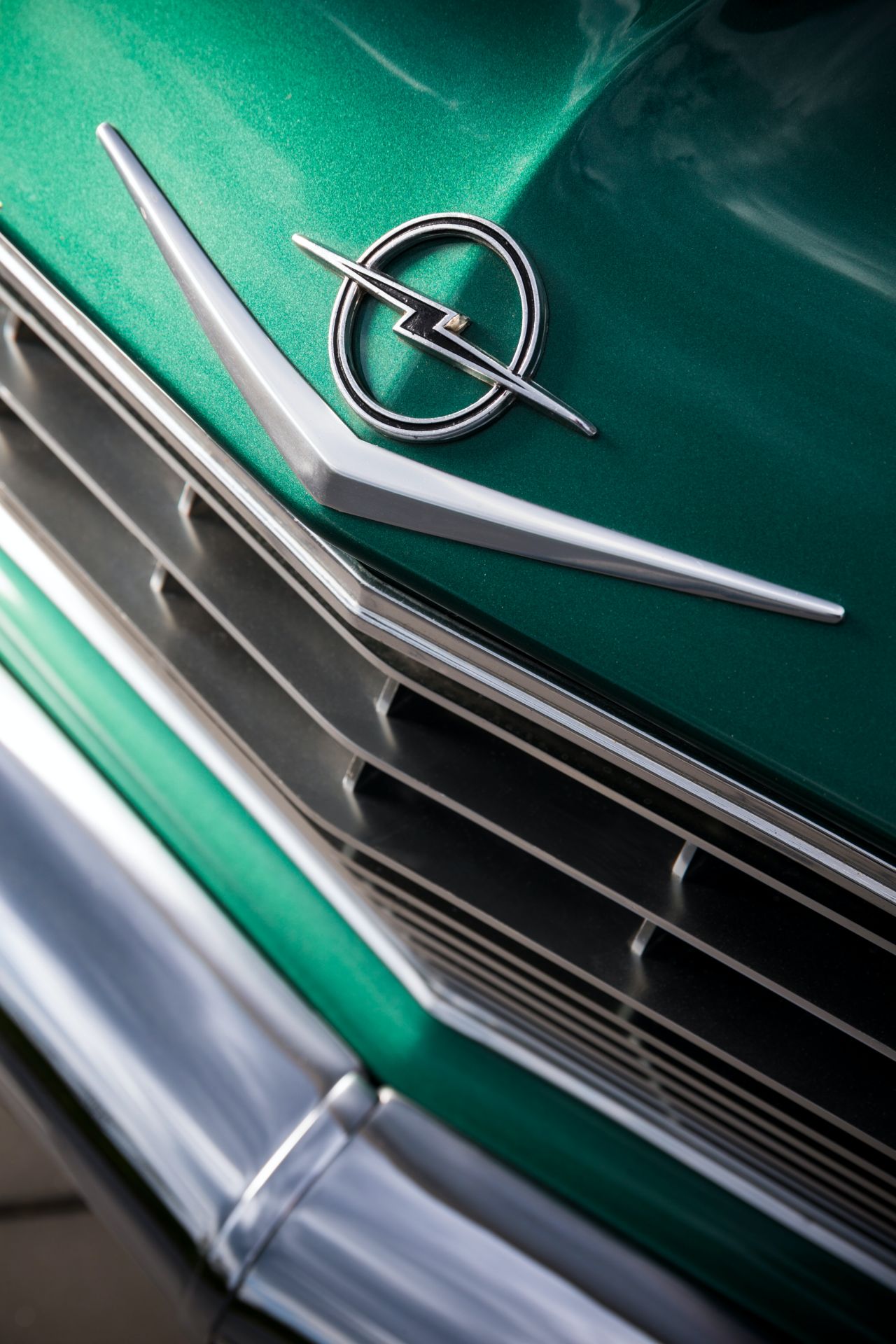
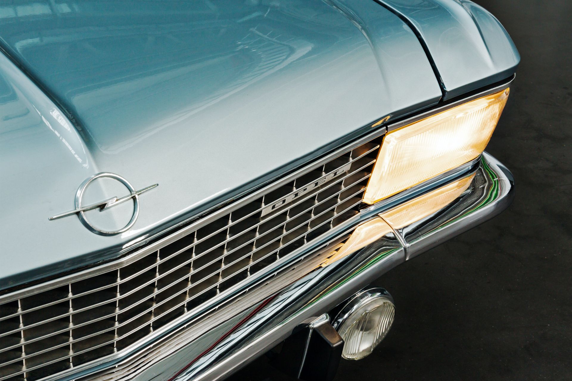
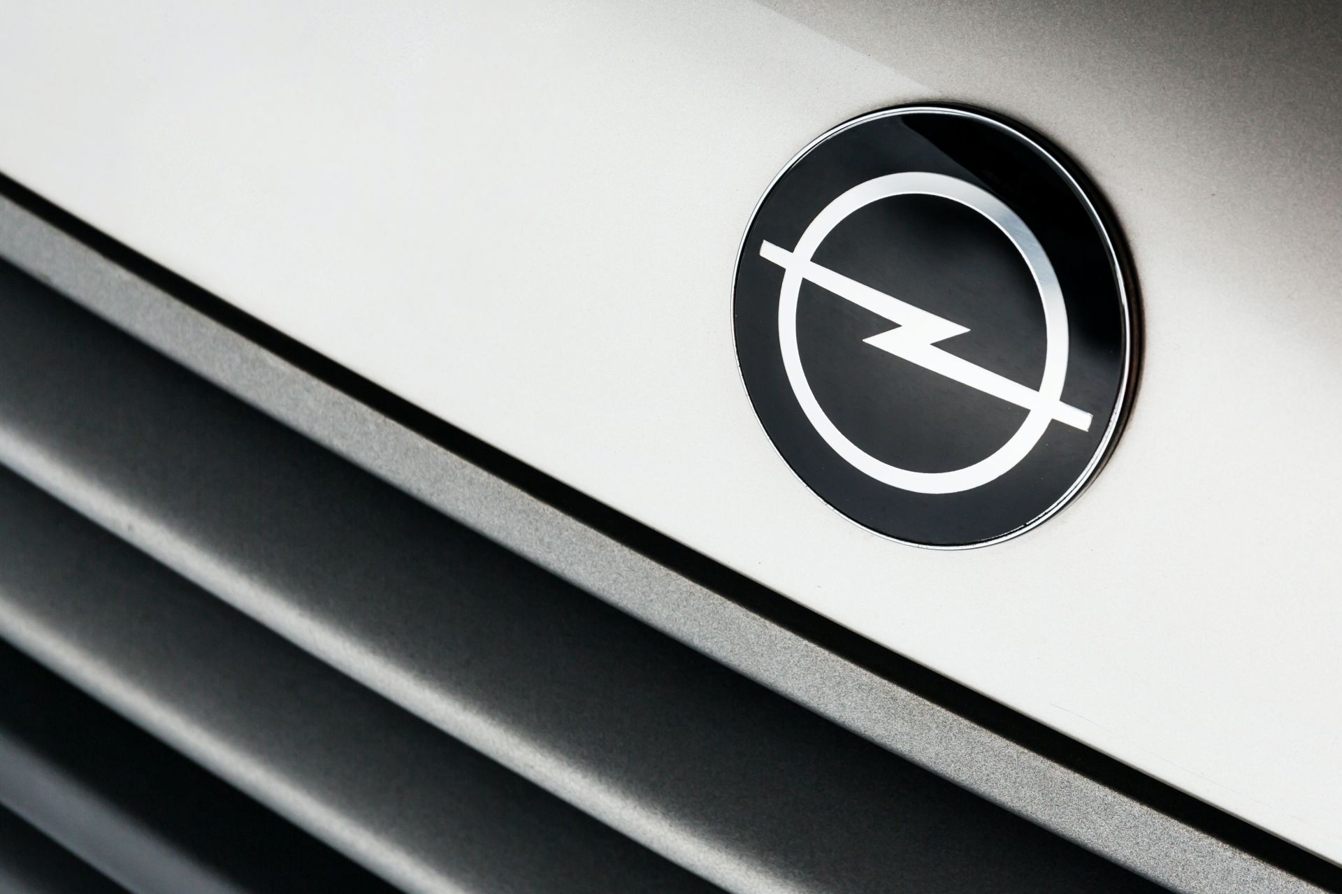
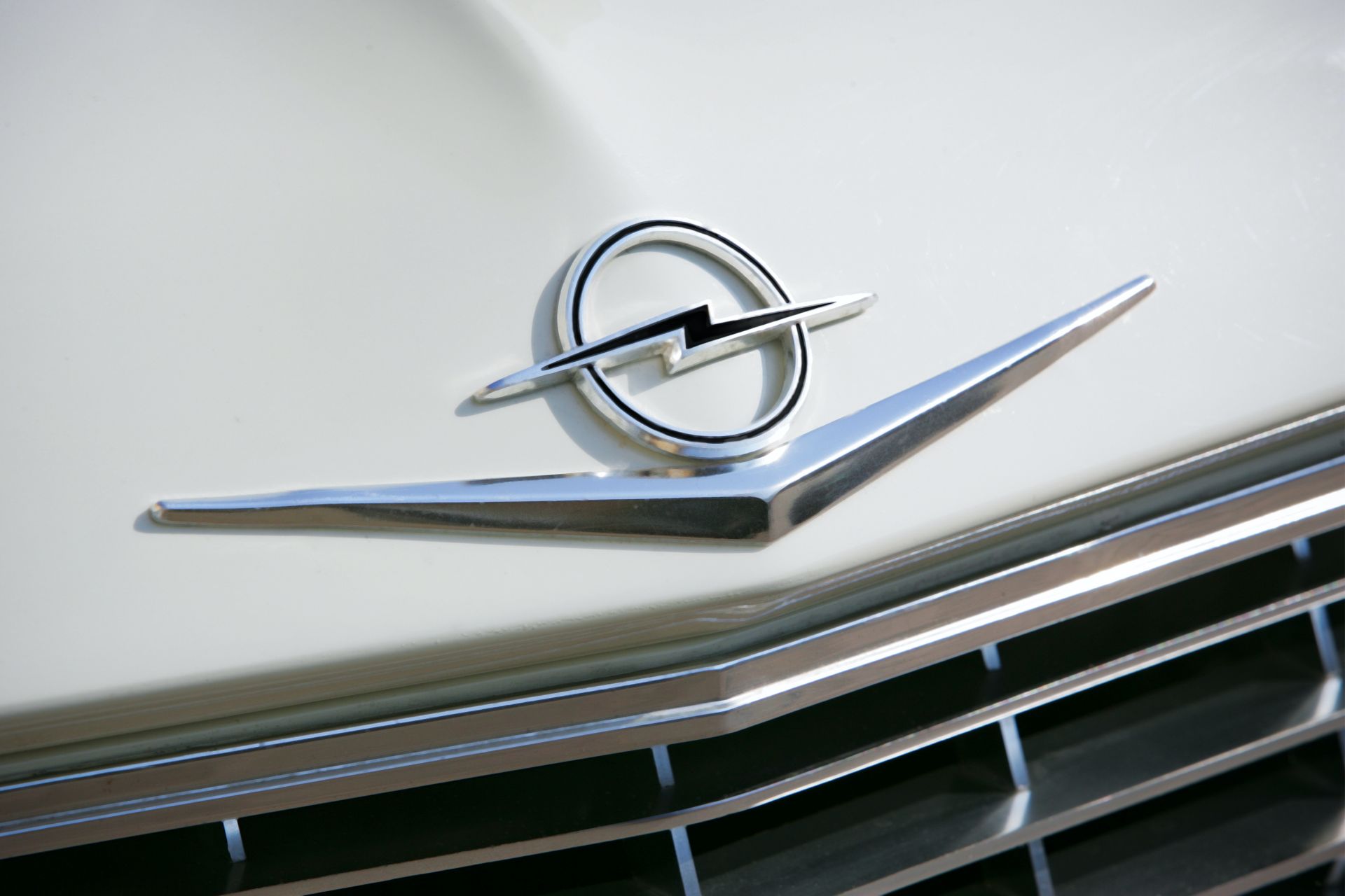
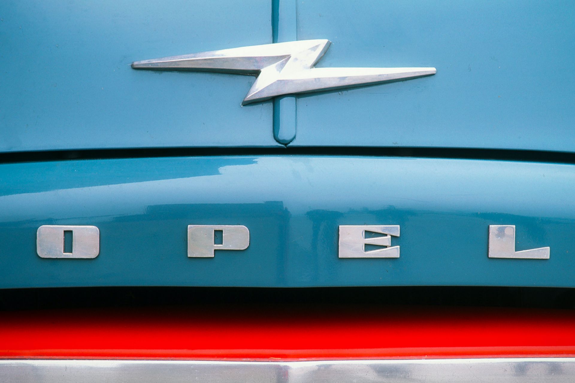
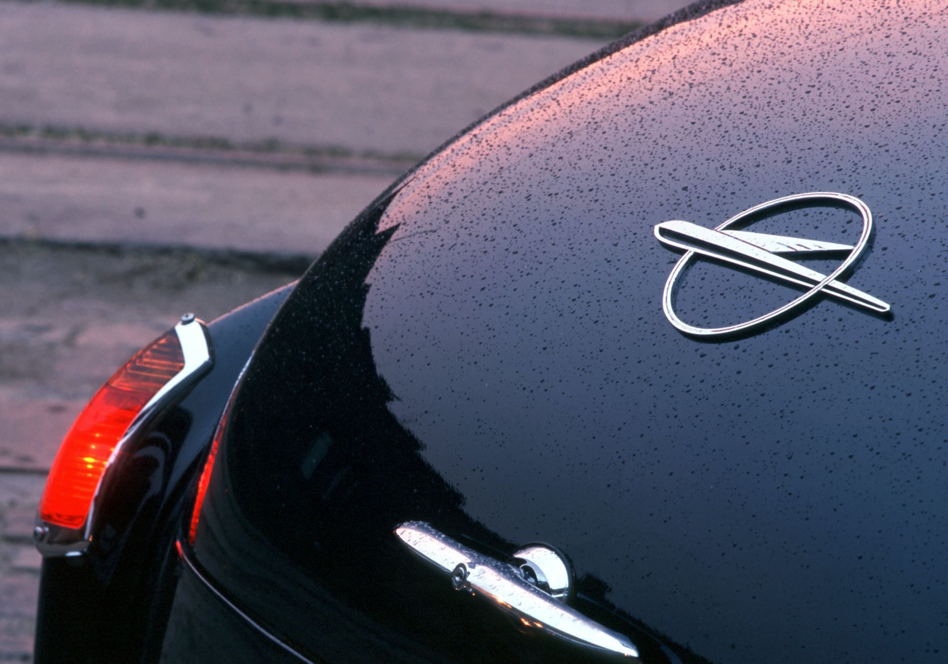
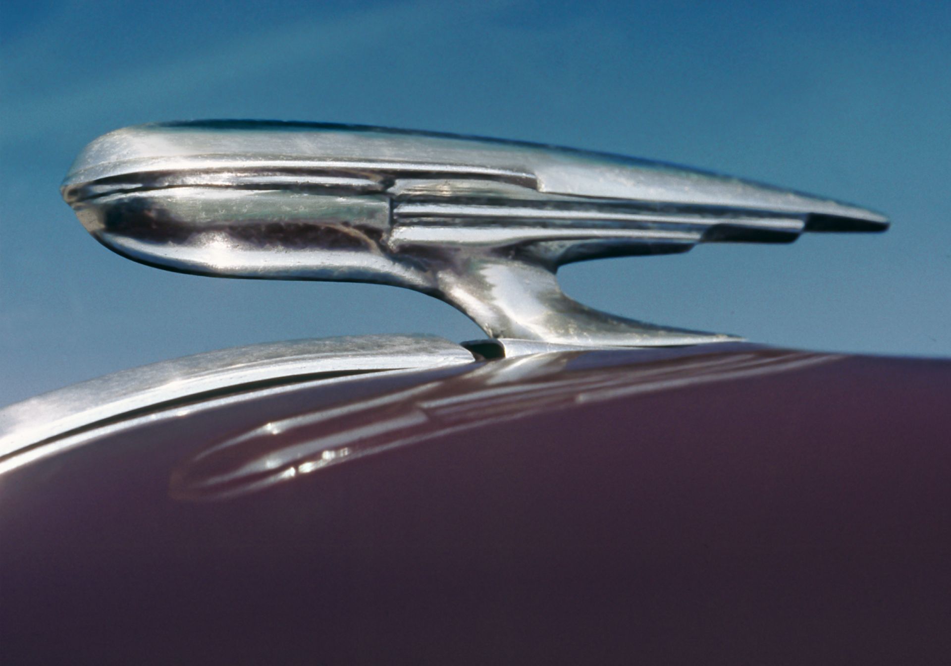
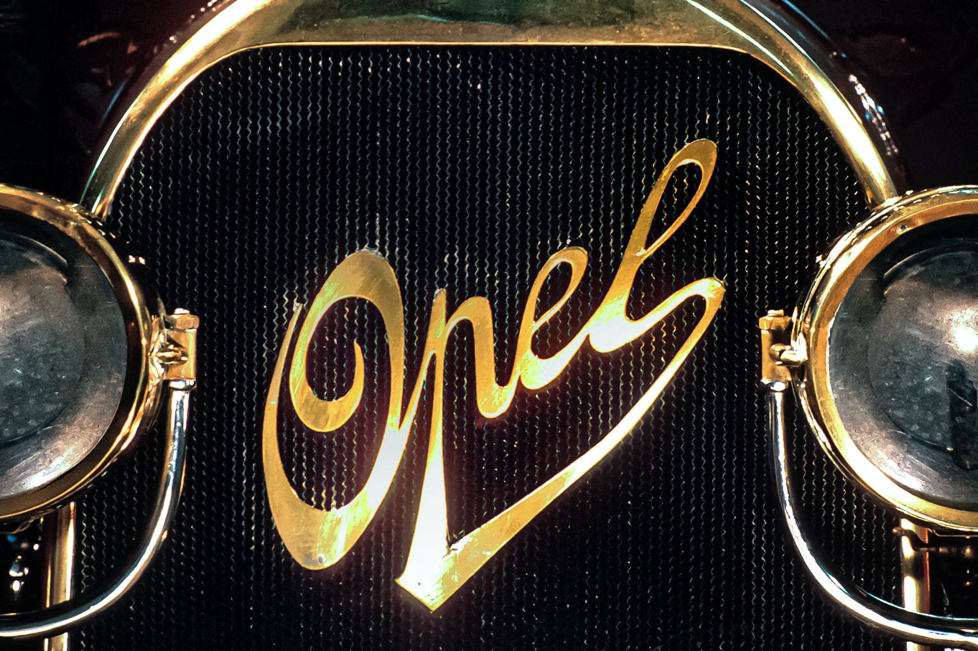
The logo depicting a flash in a circle has decorated all Opel models since 1963. Depending on the model and production year, the emblems vary slightly. From 1970, clear design guidelines were laid down for all areas of the company, with the corporate design revised for the first time in 1987.
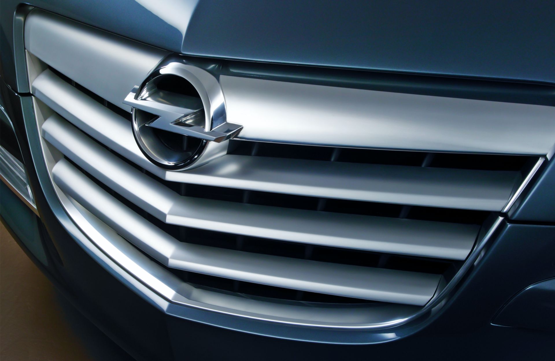
More updates followed in the new millennium, in which the lightning flash took on a three-dimensional shape, with the company logo and the emblem of the products moving closer together. From 2016, Opel models gained a precisely sculpted chrome flash, with a modern flat shape being adopted in summer 2017.
Much like the 2021 Mokka’s Opel Vizor front fascia, the redesigned flash will be adopted by the brand’s all future vehicles. The automaker says the revised emblem matches the two-dimensional logo for advertising and digital communication.


