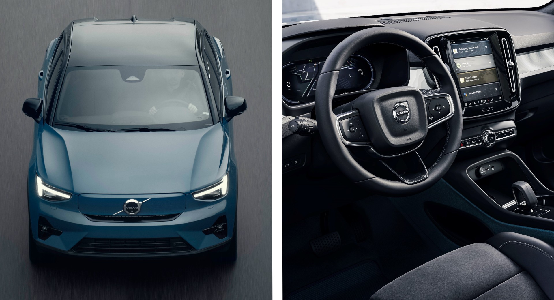
Volvo has become the latest automaker to update its logo, adopting a more simplified version of the famous Iron Mark.
The newly-designed Iron Mark logo features a simple 2D design finished in black. It is much more minimalist than the 3D design of the outgoing logo that even in photos, made it look like a physical badge.
While Volvo has confirmed that it has indeed updated its Iron Mark logo, it is not yet clear when it will start to be used on the brand’s models. Malaysian publication Paul Tan claims that the Swedish automaker could continue to use its current badge through 2022 before switching to the new design from 2023 onwards.
Read Also: Bolstered By A Car-Buying Resurgence, Volvo Sets 10th Straight Month Of Growth
As noted by Jalopnik, Volvo has been using its Iron Mark logo since 1930, although it has gone through a series of alterations over the years. The three logos most familiar to readers will be those used from 2000 onwards, all with a 3D effect of the Iron Mark symbol and blue Volvo lettering.
A plethora of car manufacturers have updated their logos over the past 18 months or so. These include Volkswagen, BMW, Nissan, Renault, and Kia.
The adoption of this new logo comes at an important time for Volvo with reports suggesting that it may go public in an IPO that could value the automaker at as much as $30 billion. It is understood that Volvo and Geely are in talks with Goldman Sachs and SEB to lead the IPO.
![]()