The BMW Group’s MINI brand has revealed a new logo, one which it says, combines “an awareness of traditional values” with “the spirit of future-oriented development”. The new MINI logo will be visible on the firm’s entire lineup from March 2018 onward.
The automaker hasn’t dramatically changed the design, as they took the current logo and simplified it, in a 2D version, with their name written in uppercase letters in the middle of a circle, flanked by restyled wings.
This combination dates back to the early years of the classic Mini, and combines brand’s traditional values with the modern era, which began in November 2000 under the BMW Group’s ownership, when the MINI as we have come to know it celebrated its public premiere.
Although the automaker doesn’t say it, there’s a very good chance that the minimalist logo marks a new beginning for the company, one where ‘electrification’ is the key word, and product expansion their main strategy.
As big of a deal as it may be for MINI, this isn’t the first time that they have shown their new logo, as it was actually revealed back in mid-2015, so it has taken them, in total, almost three years to finally apply it to their cars.
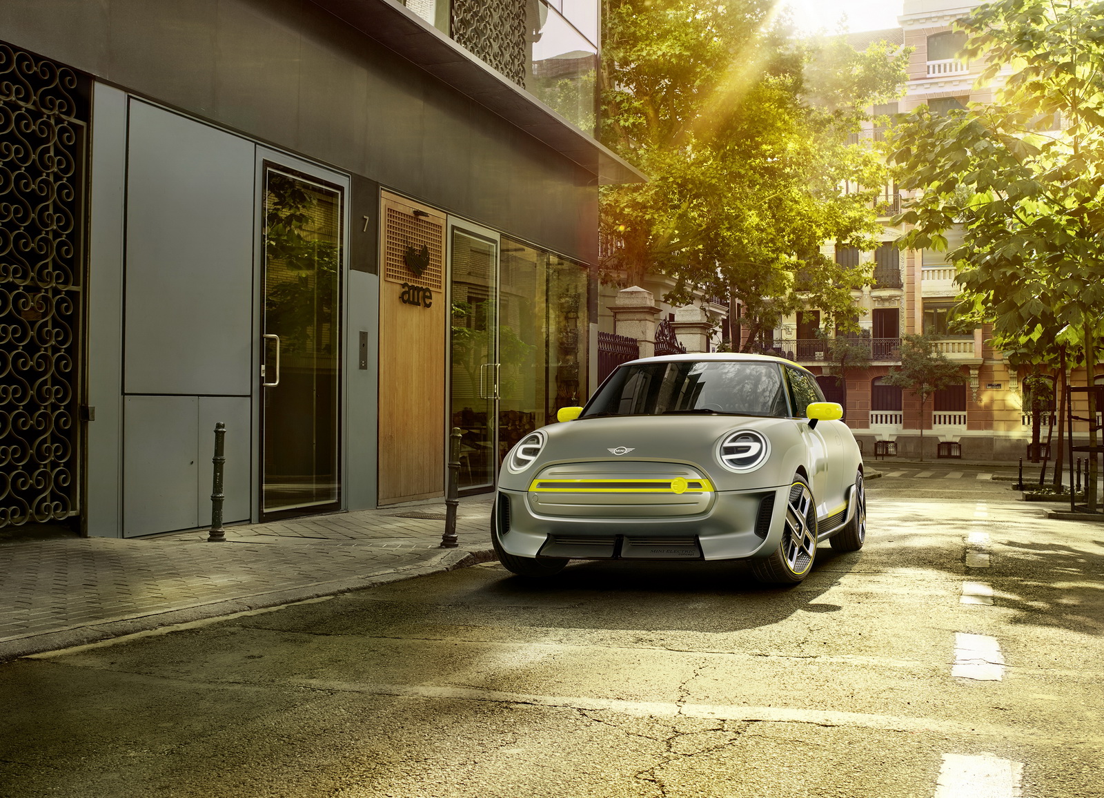
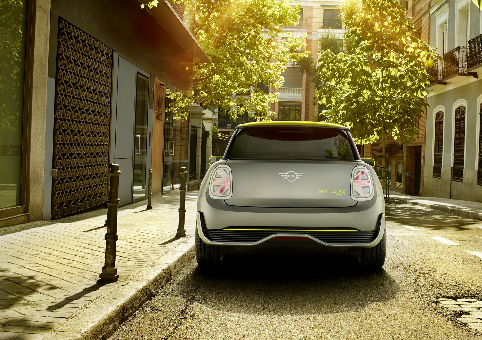
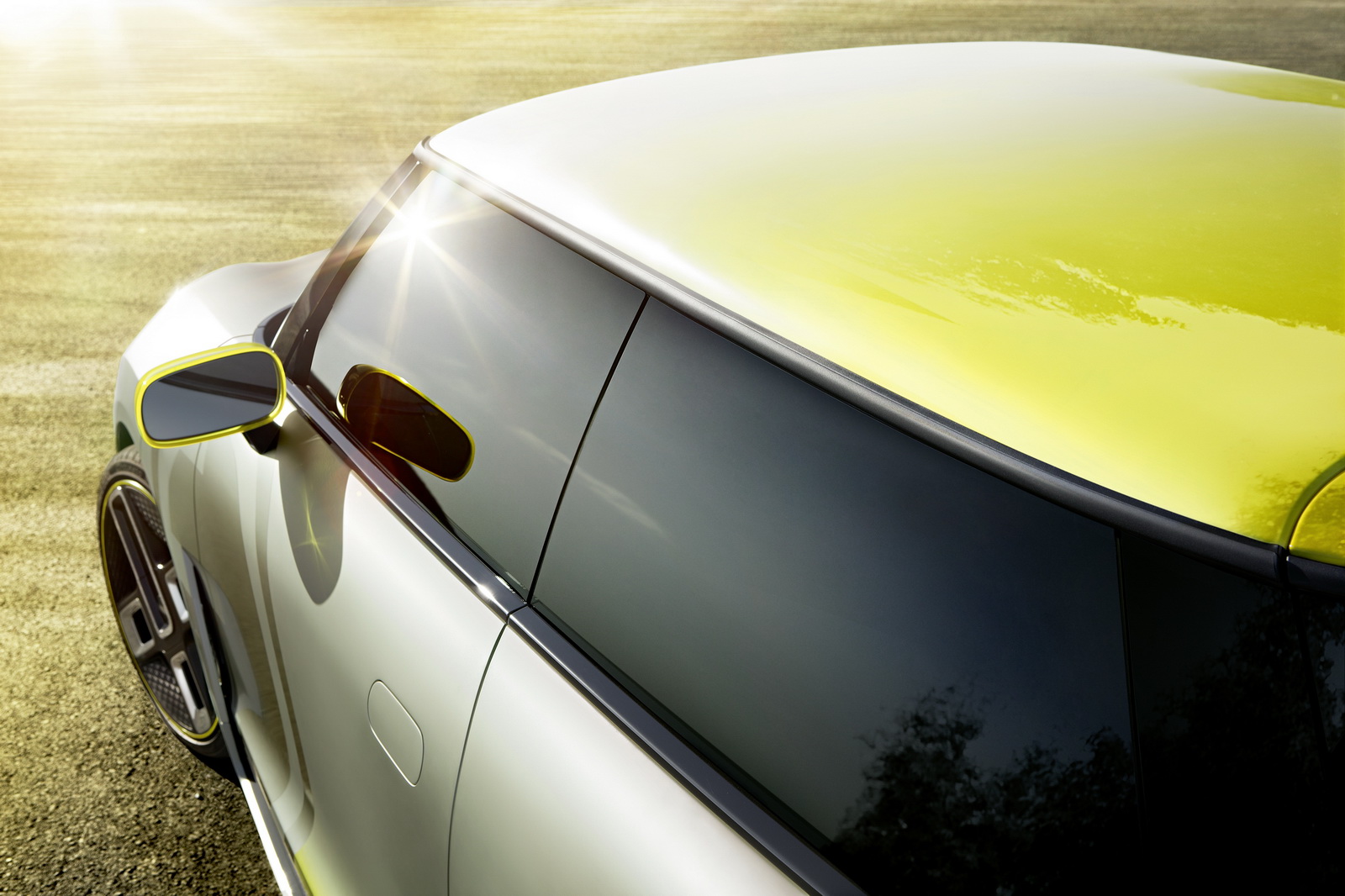
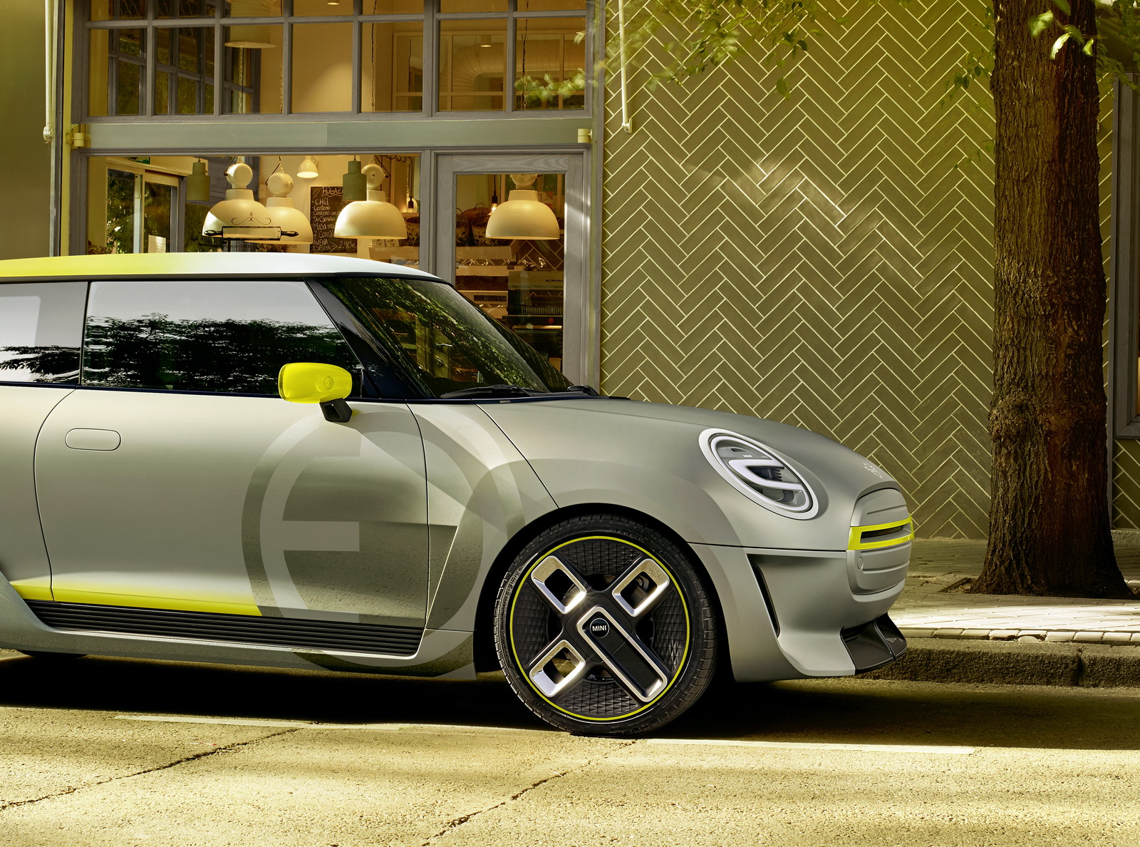
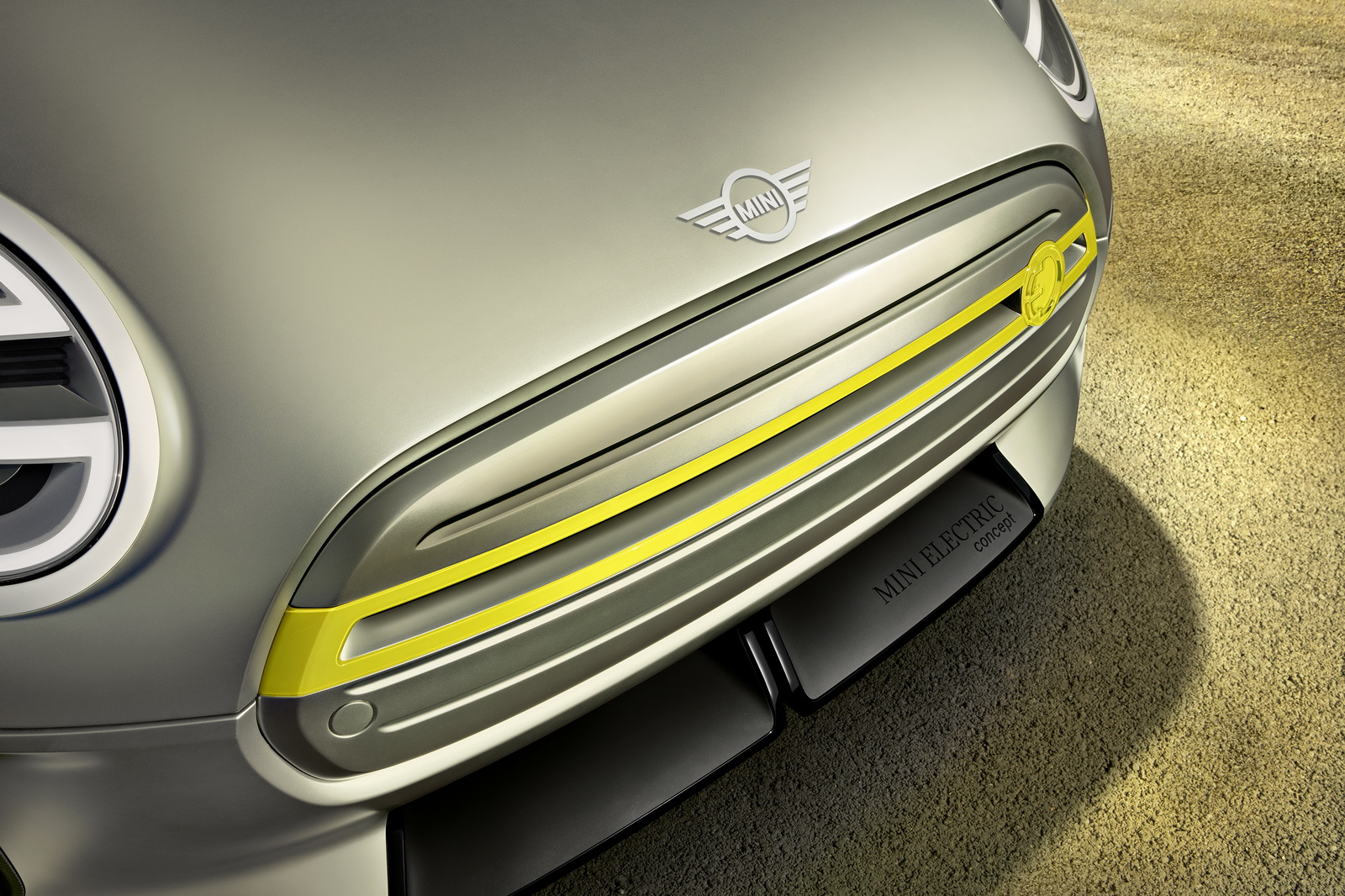
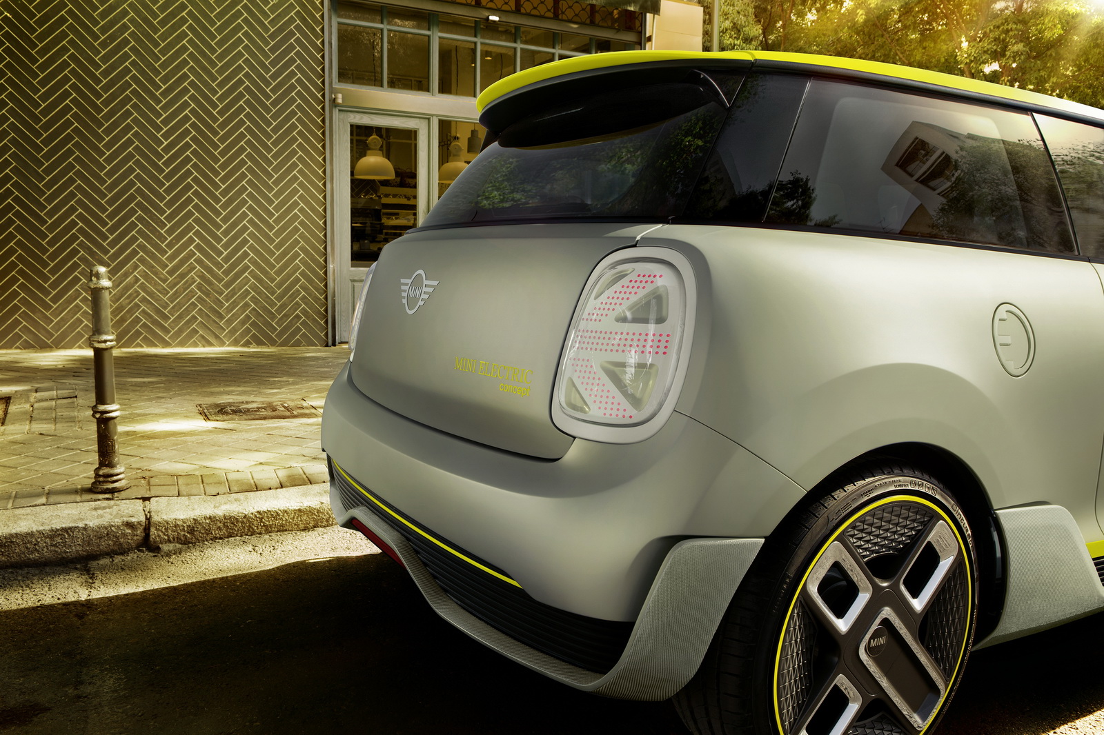
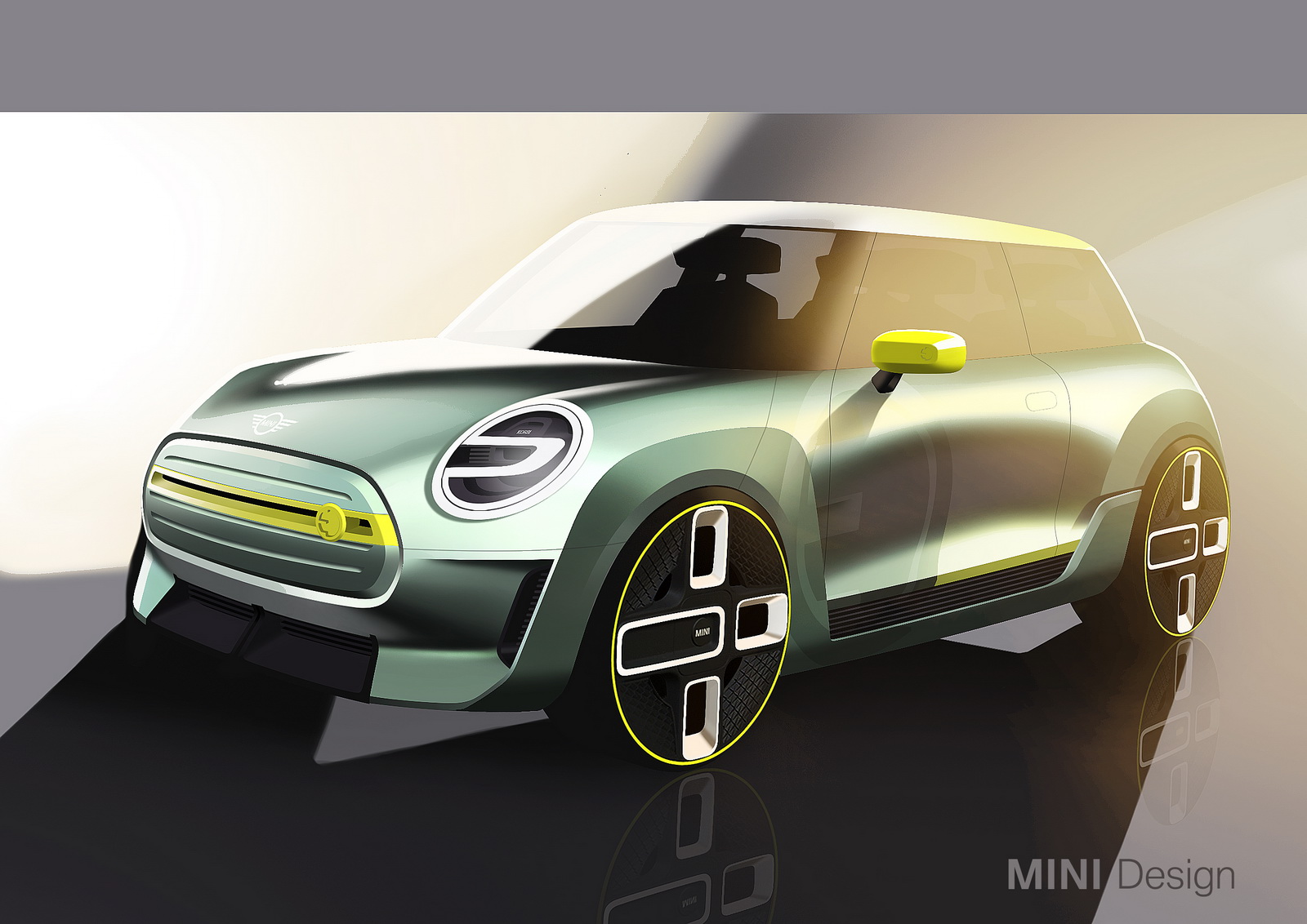
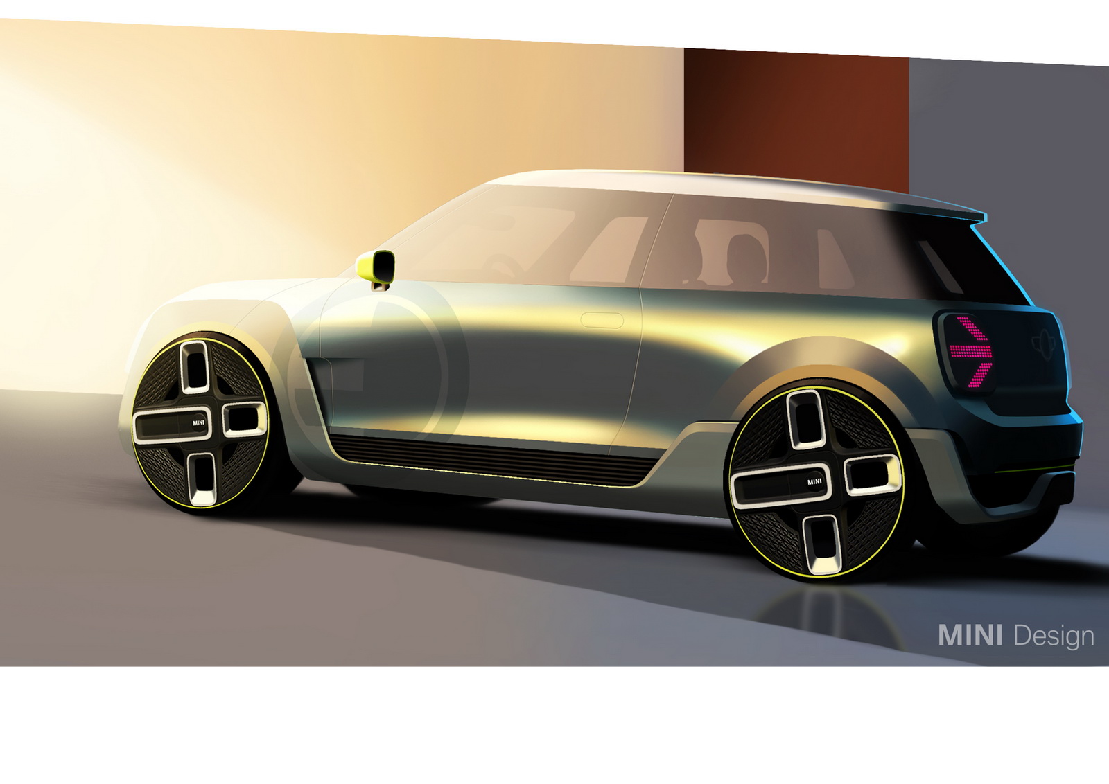
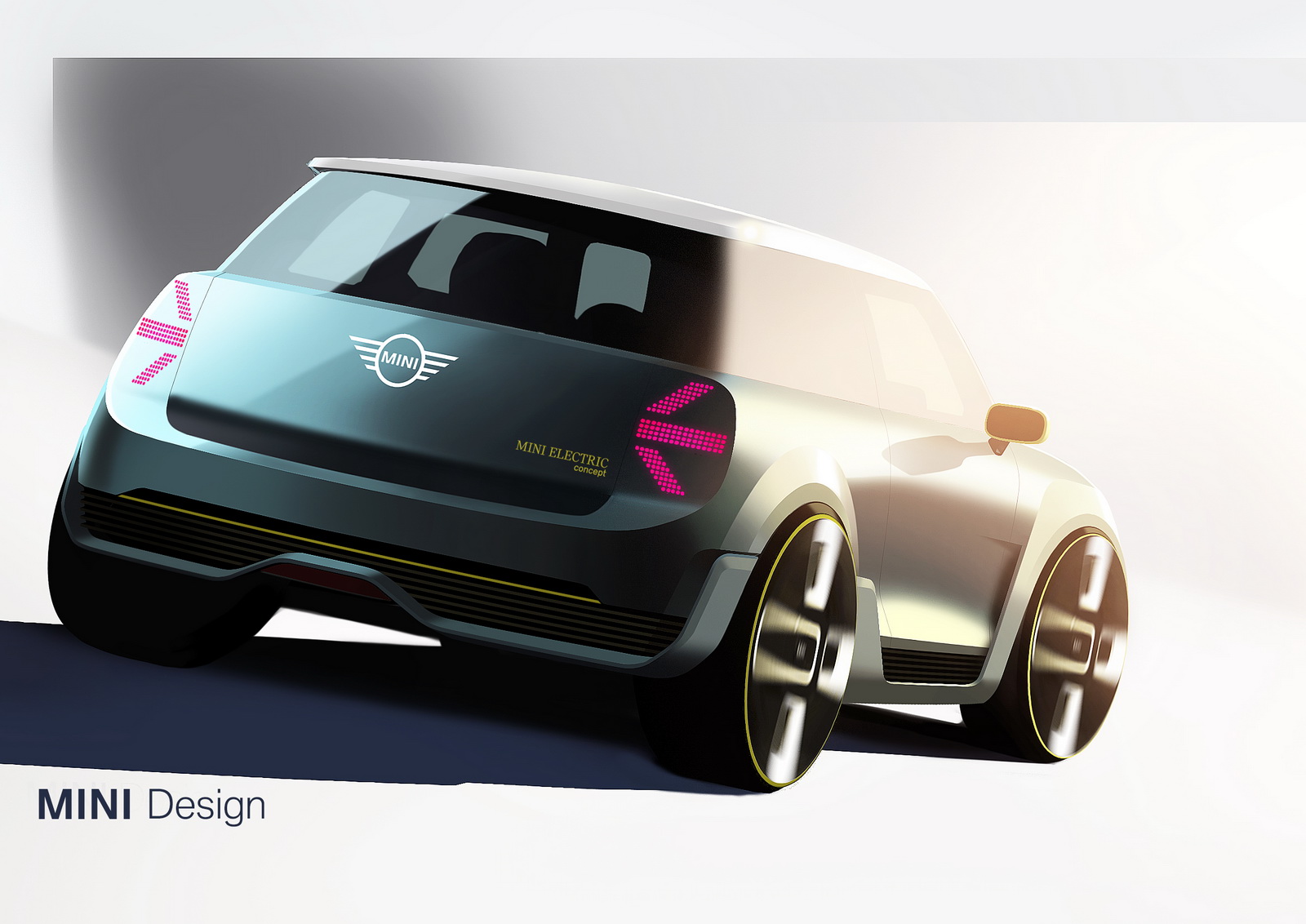
Note: MINI Electric Concept pictured
PHOTO GALLERY
![]()